Take a look at this image for a moment:
There are podcast covers that have caught your attention more than others, right?
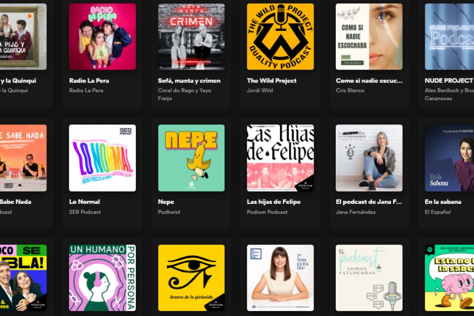
That's exactly what happens to your listeners when they access their podcast players: in rankings, on the home screen, on the screen where they check their subscriptions... everywhere.
Would you like to have one of those eye-catching covers that also conveys the essence of your podcast?
Great. You're in the right place.
In this article, we discuss the key points to consider when designing a podcast cover. diseñar la portada de un podcast.
But first...
¿Por qué necesitamos una buena portada?
The reason is clear: if a podcast cover is well-designed, it grabs more attention. When it grabs more attention, listeners and potential listeners click more.More clicks mean more visits to your podcast, and consequently, more listens.
Better podcast cover = more listens. It's as simple as that.
But... how do we catch attention in podcast players?
Let's start with a very important concept: differentiation. la diferenciación.
Differentiation
The differentiation to stand out from the rest.
In the case of a podcast cover, it's the ability to leverage different elements at our disposal: colors, typography, illustrations, images... to set ourselves apart from other covers.
Differentiation allows us to stand out among a sea of covers. It lets us be different.
But there's another concept we shouldn't lose sight of: hierarchy. la jerarquía.
Hierarchy
There's something very important to consider when designing your podcast cover. It's the hierarchy of information..
This concept is well understood when we look at a music festival poster.
Although the logical reading order would be top to bottom and left to right, that's not how we read a poster.
If you observe your behavior, you'll see that you first read the title "Retro Music Festival," and the reason is simple: hierarchically, the title is more important than the text just above it.
The same happens with podcast covers. Each element must be given the importance it deserves. Organize the information so that our listeners clearly see what they should read first.
Otherwise, they'll get lost.
Finally, before delving into the elements available for designing a podcast cover, we need to talk about managing expectations. gestión de las expectativas.
Managing Expectations
The cover of our podcast is the face we show to listeners, but what truly matters is the content.
If your cover has a professional, distinctive, and well-organized design, you'll attract more visits to your podcast and consequently, more potential listeners will give it a chance.
But pay attention, giving it a chance doesn't mean they'll become regular listeners, which is what we want.
So, two considerations:
- The cover is the result of the content , not the other way around: the cover should reflect the tone of your podcast, the style, the format...
- A professional and well-designed cover is of no use if the content is not at the same level.
The cover must generate expectations that are met in the content.
Now, after considering hierarchy, differentiation, and managing expectations, let's move on to the elements available to create a good podcast cover.
The Logo
At this point, podcasters often have several doubts:
Do I need to create a unique identity for the podcast?
The answer to this question differs depending on whether the podcast is an inbound marketing strategy or an entity itself.
If it's a marketing channel that monetizes through the sale of services or products outside the podcast, maybe playing with typography is enough, and the logos on the cover belong to your company or project.
However, if your podcast stands on its own, then it's very interesting to have its own identity.
¿Debo poner el logo de la empresa en la portada?
If your podcast is a channel you use to capture new clients or sales, it's interesting to include the company logo on the cover.This establishes a strong relationship between the channel and the brand.
How can I elegantly incorporate logos (for example, from a network)?
NOTE: "Logos" are an isotype that identifies a logo without needing to show the entire logo.
To incorporate the "logo" into the design of our cover, we use the hierarchy that allows us to demonstrate that the logo is a secondary element. It's usually placed in one of the corners of the cover.
You can add the "logo" on the cover's background or reserve a space for it with a specific color.
Typography
Regarding typography:
What types of fonts can we use?
There are three types of fonts we can use in our covers:
- Handmade: They have more personality but are harder to read. They give your podcast a more personal touch but generate readability issues, especially when reduced.
- Serif: Suggest a bit more rigor. You'll see them in fashion brands and businesses like banks. They're easier to read than handmade but might also give you problems when reduced. Use larger font sizes.
- Sans-serif: More minimalistic and better suited for digital reading. They have good readability and handle reduction better.
¿Es interesante poner el título del podcast en la carátula?
Generally , it's recommended to put the podcast's name on the cover. There are few occasions where we might remove it: perhaps if we have a great illustration that clearly explains the podcast or if the podcaster is more important than the podcast's title itself.
¿Debes añadir el subtítulo en la carátula del podcast?
Adding a subtitle can provide a bit more information to the potential listener.
It probably won't be readable in the cover's reduction (in rankings, for instance) but it will be readable when the listener visits your podcast page on the player.
If you have space on the cover, it might be a good idea to add it.
Colors
At this point, it's very important to take a look at the predominant colors in the covers of the category where your podcast is or will be.
This way, we can detect a color that isn't being used and could help you stand out.
Obviously, it has to be a color that fits your podcast. If not, look for colors that do fit and choose the one used less frequently.
Blue colors are the most commonly used overall, so it's usually a good idea to opt for another color. White has an issue: it doesn't stand out on players with a white background.
Then there are aspects of color psychology that are also important to consider, but that's a topic that could fill an entire article.
Photos
One of the common doubts I've seen among podcasters is whether or not to include their photo on the podcast cover.
As always, everything is relative, but common sense tells us that if you have a strong personal brand and a community that follows you, it can be very interesting to appear on the cover.
Even your photo and name can become more important than the podcast's name itself.
Look at Tim Ferris's podcast cover, for example. I didn't realize the podcast was called "The Tim Ferris Show" until long after I started listening to it.
Others
Other elements can be very interesting when designing your podcast cover:
- Illustrations are very interesting for a podcast cover. Often, an illustration can better explain your podcast than a photo or a title. They offer a lot of freedom and allow you to convey aspects that would be difficult to express with an image.
- White space, or "breathing room": It's advisable not to overcrowd the cover. To achieve this, try to give each element of the cover its own space and have empty space between them. Let the cover breathe. Less is more.
Episode covers
Regarding episode covers, there are also common questions:
Do I have to design a cover for each episode?
Designing a cover for each episode is interesting. It helps add dynamism to your podcast, better reflects what each episode contains, and attracts more attention.
Cómo diseñar las portadas de los episodios para que sean diferentes pero mantengan una línea con la portada principal
It's interesting to strike a balance between flexibility and visual linkage with the main cover.
To achieve this, you can use specific fixed elements (always present) and other more flexible elements that can appear and disappear from the designs.
Technical specifications of the covers
If you want your podcast to stand out in players, you have to provide them with good image quality.
- Minimum size: 1400 x 1400 pixels (If you serve the podcast image from Apple Podcast RSS, it requires a minimum of this size).
- Maximum size: 3000 x 3000 pixels is the ideal size according to Apple Podcast Guidelines.
- Format: PNG or JPG at 72 dpi resolution.
- Color: RGB (color generated from light).
According to Apple Podcast guidelines, it's advisable not to place important elements at the bottom of the cover because some players darken this area to add elements like audio progress bars, labels, etc.
¿Cómo debe ser la portada de un podcast de pago?
If the cover is important in a monetized podcast with indirect revenue, it's even more crucial in a paid podcast. aún más.
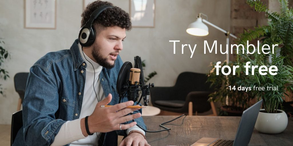
If your podcast is on Mumbler, we recommend investing in your cover: either with your own skills and time or by hiring a designer.
Your premium podcast is your business, and it's essential that the cover looks professional. Undoubtedly, it will help you gain more subscribers.
Conclusion
The cover of your podcast is not something trivial. It's the visible face of the podcast and therefore should convey its essence.
If we don't dedicate the effort it deserves, we might miss opportunities.
If you're looking for tools to design a podcast cover, check out our article on tools for podcasters..
Do you have any other advice or experiences that could help us all create better covers? Share them in the comments.
Best regards!
About the author
Mumbler CEO & Cofounder. Slow content creator: newsletters, podcasts and videos.